Wearables—smartwatches—have been touted as the next big thing, and tech giants like Apple, Samsung, Nike and Google have poured resources into making this technology a success. According to the research company, Nielson, “Seventy percent of consumers are already aware of “wearables,” and about one in six (15%) of them currently use wearable tech—such as smartwatches and fitness bands—in their daily lives.”
So why has the market for wearables been slow to catch fire? Why have they failed to take off in the way that smartphones or tablets have?
And how can tech companies more effectively communicate and inspire their budding wearable audience to make these items into must-haves?
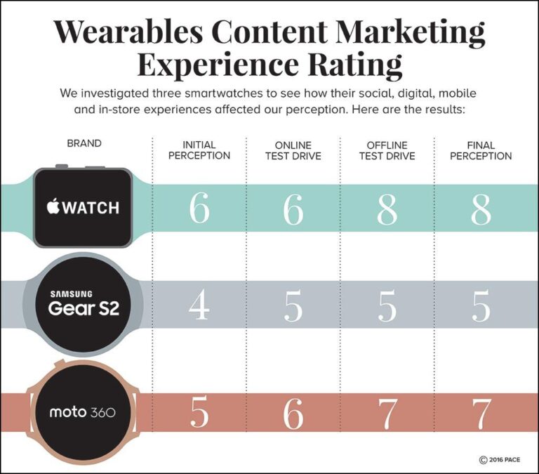
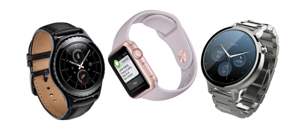
In this column three smartwatch cynics checked out the Apple Watch, Samsung GearS2, and the Motorola Moto360. They consumed marketing content online and in-store, and evaluated its effectiveness in shaping positive opinions and inspiring engagement and action.
The process and findings were revealing:
Alex Trice, The Apple Watch
Smartwatches intrigue me. From first impressions, they seem convenient and trendy, but are they a must-have? That’s up for debate. I’ve always viewed smartwatches as wannabe phones. I wasn’t sold, and that’s partly why I was excited to do this content review—to see if I could be swayed otherwise.
Online Experience
I first checked the Twittersphere to learn what Apple leaders and engineers envision for the future of the product. I was surprised to find that Apple doesn’t have an official social page, which says a lot about the company’s clout. Still, it seems like a missed opportunity because it would allow Apple to control more of the conversation around their products.
While searching online, I found an amusing quiz: Do I need an Apple Watch? After laughing through each of the questions, I ended up with this result:
“There is nothing an Apple Watch can do for you that a Casio and a smartphone isn’t already doing. Step away from the Apple store – book a nice holiday instead.”
The quiz helped confirm what I already thought: I don’t really need a smartwatch. But still, I wanted to know what more serious sources had to say about the product, so I searched for reviews from sources I trust, like CNET. CNET shows you where to buy the Apple Watch and what prices you could expect at each retailer. As I read more into the review, it further confirmed my impressions of the watch: it’s nice, but more of a phone accessory than a standalone device.
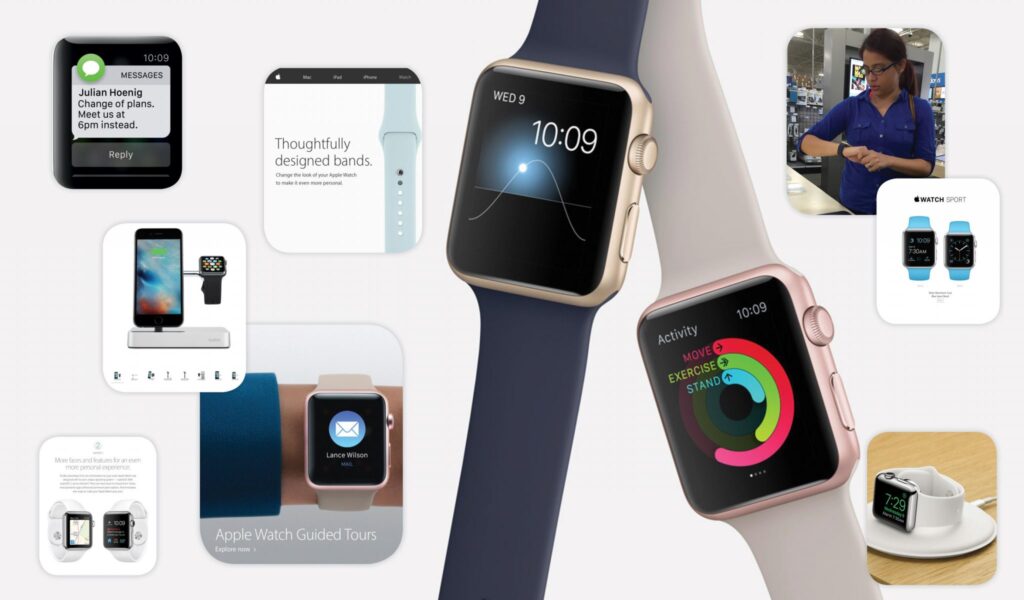
Apple’s splashy immersive webpage was elegantly designed, but also fun to scroll through and explore.
Despite the lackluster web response, I went to the source, Apple’s website, to see how they were marketing the usefulness of the watch. Apple’s splashy, immersive webpage was elegantly designed, but also fun to scroll through and explore. One of my favorite parts of the page was a grid with pictures and blurbs about various features of the Watch, like Wallet, which highlighted the fact you could use Apple Pay to buy groceries with your wrist. Keying on specific examples was very helpful in getting me to envision reasons why I would need an Apple Watch.
In-Store Experience
The elegance of the product online set my mental expectations to interested, but hesitant. As soon as I strapped on the watch and double-tapped the screen, I was presented with a visual demo that flew through the watch’s capabilities like map screens, emails, photos, and Siri commands.
I felt the gentle buzzing of notifications at my wrist, and was pleasantly startled when I felt the throb of a heartbeat. It made the device feel intimate and personal, something I could see myself wanting much more now than I did after my online research. The salesperson had nothing but positive things to say about the Apple Watch, even though she owned a Moto 360. She told me she wished she’d gotten the Apple Watch, because you can take phone calls from your wrist rather than your phone—something she couldn’t do with her current smartwatch.
Recommendations
One of the most impressive capabilities was the watch responsiveness. It was easy to swipe between screens and navigate across apps. Showcasing that same experience on the mobile version of the Apple website would be very effective because I better understand things when I can touch and feel them. Rather than sit through videos of the features, Apple should build a portion of their Watch immersive (or at least the pre-installed iOS Watch app) to interactively allow consumers to experience the smartwatch by swiping their tablets or phone onscreen to mimic the swipes and navigation of the watch face.
Josh Barrer, Samsung GearS2
Here’s where I am at with wearables: I already have a smartphone, I don’t need my watch to do the same things on a smaller screen. “But it can be used for fitness!” you say. Meh. I’ve already got my family, medical professionals, and mirrors urging me to be more fit. I don’t need that guff from my watch, too. With that in mind, let’s check out the Samsung Gear S2!
Online Experience
I began my research on the Samsung Gear S2 with a check on social media. The results were underwhelming: a (quick) search on Facebook didn’t bring up any pages, and on Twitter, I only found an unofficial page—@SamsungGearS2. The page did yield some useful information: retweets from satisfied customers, links to product reviews, some images. I’ll admit I liked the look of the watch. It’s got a nice, clean design—it looks like a watch, not an arm computer. I appreciated that lack of ostentatiousness. My interest was piqued, though the general lack of strong Samsung social media support distressed me. Is this a product that it’s own makers don’t feel confident about?
I headed back to Google to find some more info. I started with a quick search for the product on Google News: no product recalls or unexplained fires. Good sign. Then, I did a search for reviews. Plenty of results came up: I checked out a review on The Verge, a site I trust. It made some good points regarding the watch’s strengths and weaknesses. The intuitive controls sounded appealing, and navigation apps seemed useful. And yes, I suppose some of the fitness apps could be ok.
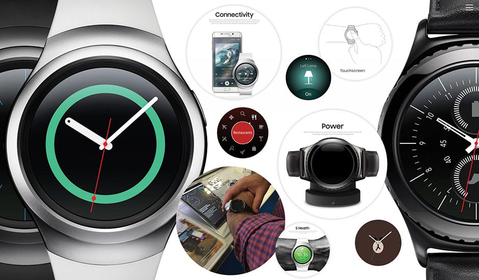
The Gear S2 page on Samsung’s site was well designed, placing the product and it’s attractive design up front. When I got to the text, it focused on many of the qualities mentioned in reviews I’ve seen: the bezel based controls, and apps designed for navigation and fitness. It also brought up the watch’s capability as a music storage device, which could be fun.
I also checked the mobile version of the Samsung site. With a similar, visual-first design, it routed me to the necessary watch info (specs, price) more quickly, which I appreciated. Looking on my phone raised another question, though: would this Samsung product be compatible with my iPhone? A search on Google revealed that currently the Gear S2 is not compatible with Apple products. Uh-oh. That wasn’t good. Still, I wasn’t sure I’d really need to sync my phone and my watch, so it wasn’t a complete deal breaker. It was a concern though.
In-Store Experience
I went to Best Buy to get a look at this thing in person. This is vital: I’ll shop online, but with items I wear, I want to know what they feel like, and see firsthand how they function.
I’ll shop online, but with items I wear, I want to know what they feel like, and see firsthand how they function.
The in-store Samsung display wasn’t as large or impressive as Apple’s, which again made me concerned that it’s a product Samsung isn’t fully supporting. It’s not a good feeling to invest money in something and then discover its maker has essentially given up on it. In person, I continued to like the look of the watch, and enjoyed navigating through its different screens and functions. The rotating bezel controls were not as instantly intuitive as some of the reviews made them sound, but with time, I could see how it might be preferable and more reliable than strictly touch based controls.
Speaking briefly with the sales associate, he confirmed that there’s no current compatibility between the Gear S2 and Apple products. On the other hand, after I asked some questions, he made a reasonable case for the product’s usefulness. For example, he explained that he’s able to use his watch to talk on the phone while driving or doing other tasks, without having to hold a phone in his hands. I hadn’t considered that, and it struck me as a good use for these products (and the kind of practical function that Samsung should be talking about in their marketing).
Recommendations
Although I left this process with a higher opinion of the Samsung Gear S2 than I started with, I’m still not convinced it’s a product I want or need. Samsung’s marketing seems to be taking a “let the product speak for itself” tactic, which strikes me as the wrong approach here: a smartwatch is an expensive luxury item, and they need to convince me I need one. If Samsung created content emphasizing the watch’s value as a hands-free communication device, or a navigation tool, or… well, anything they want to define it as, it would go a long way towards justifying it’s existence and convincing me to make a purchase.
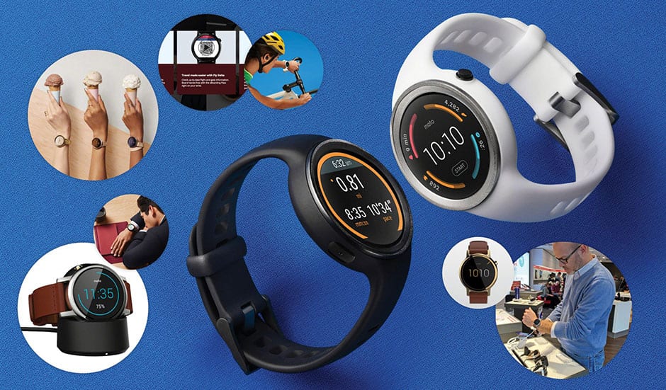
Chad Hayton, Motorola Moto360
Before the release of the first iPhone, I always wore a watch. It was part tool and part fashion accessory. But after the rise of the smart phone I slowly fell out of love with my watch. My smartphone seemed to do everything I needed: it was a phone-watch-email-calendar-camera Swiss Army knife. Why would I need to wear a watch when I carried one around in my pocket all day long? And so I stopped wearing my watches. I still have a line of neglected watches on my dresser that I never wear anymore.
When the new smartwatches were first announced, I was both excited and suspicious. They promised a slick integration of the conventional watch form and smartphone functionality. But could they deliver on that promise? If not, the smartwatch was going to be just an expensive novelty watch—and I certainly didn’t want that. If I was going to spend a few hundred dollars on a watch, I wanted to make sure I would use it.
Online Experience
I looked at the Moto360. To get a sense what other users thought of their smartwatch I went to Facebook. The Facebook experience was a serious disappointment: I couldn’t find much information at all and the only page I did find seemed to be a fan page filled with photos and memes about the Moto360—some flattering, some not so much. It seemed that social media was not going to help me make my decision.
So I abandoned social media and turned to the search engines. Google led me to a review of the Moto360 on Wired.com that provided some valuable information on the device, but not much about how it integrates with other devices—in particular my iPhone. Luckily, my search turned up The Verge’s excellent video review, which revealed that the Moto360 runs Android Wear 2.0 and integrates seamlessly with the iPhone.
I turned to Amazon’s customer reviews to find out what real buyers thought of the Moto360 and get a sense of price. The reviews were generally positive which started to give me some hope, and I discovered that the Moto360 not only looked nicer than the Apple Watch in my opinion, but also cost $100 less.
What really turned my head was Motorola’s build-your-own-watch ‘moto maker’. Motorola had merged tech nerd with watch geek.
At this point, my interest was piqued, but I wasn’t quite ready to spend the money on the watch. I visited Motorola’s website: it was clean and stylish and the marketing toward professionals spoke directly to me. But what really turned my head was Motorola’s build-your-own-watch ‘moto maker’ that allowed me to customize the style, bezel, case, band, and the face of my watch. Motorola had merged tech nerd with watch geek.
I had to go check one out in person.
In-Store Experience
When I arrived at the Verizon store the smartwatches were setup in their own section of the store where you could see the various models side-by-side. They were secured with flexible cable that allowed me to pick up and try on a couple different models including the Moto360 and the LG Urban. Though the stand labeling made it difficult to differentiate among watches, I definitely appreciated the ease of comparison and the ability to try on and experiment with the watches directly.
After a comparison of several watches, it became clear that the watch design was the only thing that differentiated the Android Wear 2.0 watches from one another. But that didn’t dampen my enthusiasm. By the time I left the store I was definitely convinced that I wanted on of these watches.
Recommendations
A watch is such an intimate accessory. The ability to customize and experience it in person is critical to the purchase path. Motorola’s website did a great job allowing me to experiment with different watch faces, bezels, cases, and bands; their website was what moved me from curious to excited about the product. Verizon’s hands-on jewelry store setup of their smartwatches helped to close the deal by allowing me try the watch on in person.
