Email designs to leave in the past
We’re already two months into a new decade! Let’s look back on the evolution of email and some trends that should be left in the past.
Clutter-heavy email designs
When everything is important, nothing is important. Emails jam-packed with info are overwhelming to subscribers. It allows for no hierarchy or structure to follow and makes it extremely hard to focus on key information. And this also goes for copy and calls to action. A subscriber should open an email and at a glance understand one direct next step. Even if you have a lot you need to say in one email, there are designs that can help you communicate clearly.
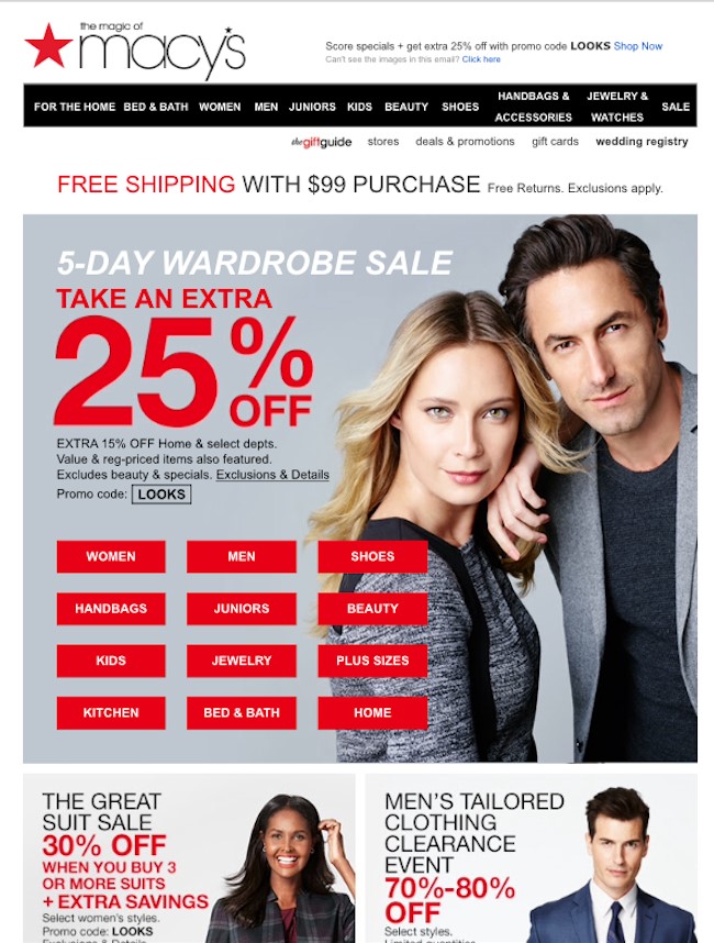
Macy’s sale email has too many conflicting red headlines combined with duplicative category CTAs in the top navigation bar and in the hero spot.
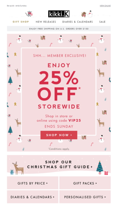
Kikki.K shows a better way to promote, allowing space breaks for alternative clicks to reduce confusion and speak more directly to readers.
Above the fold everything in email
You’ve heard about the importance of “above the fold,” which has led marketers to include as much as they can at the top of the email. However, with mobile-first campaign designs, this tactic isn’t necessary. The method may have worked on desktops that allowed for wider screen viewing, but today’s mobile viewers aren’t afraid of a little scroll action and prefer it over clutter.
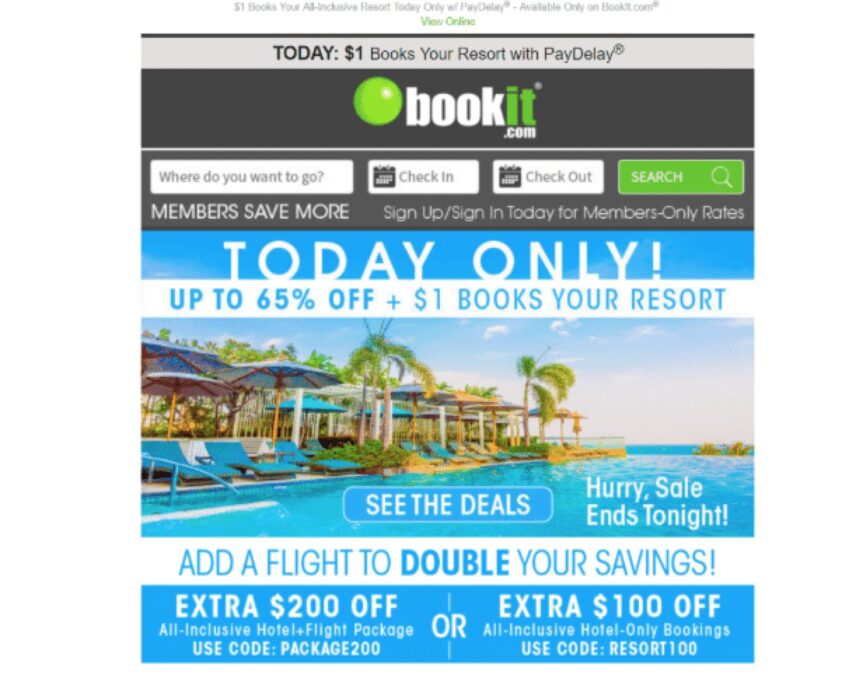

Promoting a limited-time discount doesn’t have to be confusing. Bookit.com is allowing no space to breathe in the hero.
Airbnb features a neater, calmer approach to promoting a destination, a discount and even some daily itinerary ideas.
Image-heavy messages
While it’s great for brands to want to stand out using imagery, it’s only captivating if it’s rendering. All-image emails may add character and identity to an email but they come with significant accessibility issues. To be clear, this trend isn’t alienating the images, it’s ensuring you’re building the email properly and setting the images up with alt text and text within the body copy of the email to make sure you’re deploying a message that is sufficient, even with user-friendliness hurdles.
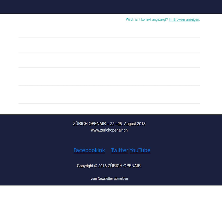

An all-images email that doesn’t render.
How the email was actually intended to look.
One size fits all for email marketing
Dynamic data and content functionalities have set a new norm. Subscribers are no longer satisfied with a broad email that shows no sign that the brand truly understands them. Segmentations targeted at specific audiences aren’t just a nice-to-have anymore; they should be the standard.

If you’re currently hanging on to some of these techniques in your email marketing efforts, this is your year to try some new tricks (and templates) to entice and delight your loyal customer following! Stay tuned for part two: What’s trending in email design.
